Keywords
Authorizations, license
-
Visible by: Everyone -
All rights reserved
-
262 visits
a bit of self-promotion


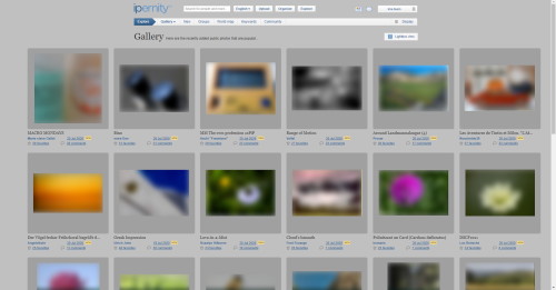
So I decided to create my own photo gallery (powered by Piwigo).
It's not like I am leaving Ipernity - no, by all means no!
I just want to have some my favorite photos (my photos that I appreciate the most - for very different reasons) kept together and shown to my (not so frequent) guests.
I disabled (there) comments, user registration, faves and shares. Not everything is top-quality yet. But is not bad, for starters.
Please click this link
https://martaw-art.pl/gallery/
and tell me here what you think.
Is it any good?
Scott Holcomb, Annemarie, Ecobird, Dominique 60 and 3 other people have particularly liked this photo
- Keyboard shortcuts:
Jump to top
RSS feed- Latest comments - Subscribe to the comment feeds of this photo
- ipernity © 2007-2025
- Help & Contact
|
Club news
|
About ipernity
|
History |
ipernity Club & Prices |
Guide of good conduct
Donate | Group guidelines | Privacy policy | Terms of use | Statutes | In memoria -
Facebook
Twitter


Marta Wojtkowska club has replied to Boarischa Krautmo clubI assume that you are using a desktop version of a browser, not a mobile.
Can you click the paintbrush icon (at the right), switch themes and tell me which one do you prefer: light or dark?
Boarischa Krautmo club has replied to Marta Wojtkowska clubDefinitely the dark theme, it's now better than not bad ;-)
Marta Wojtkowska club has replied to Boarischa Krautmo clubI prefer the light one (it's a derivative that I made myself and I am proud :)).
Nevertheless I intend to leave the theme switcher there so both "skins" will be available.
Boarischa Krautmo club has replied to Marta Wojtkowska clubBut a dark backgrund is imho more eye-friendly.
(and of course, as Leon said, I live in dark places ;-))) )
I like your monochromes very much! My favourite, well, it is mono, yes, but not b/w: martaw-art.pl/gallery/picture.php?/16/category/21
I like your project.
Marta Wojtkowska club has replied to Leon_Vienna clubLight version is my choice because it is definitely better for monochromes. Isn't it so? :)
Leon_Vienna club has replied to Marta Wojtkowska clubI bookmarked it. ;-)
Marta Wojtkowska club has replied to Leon_Vienna clubMarta Wojtkowska club has replied to Annemarie clubMarta Wojtkowska club has replied to Annemarie clubThank you!
Marta Wojtkowska club has replied to Dominique 60 clubWell done
Marta Wojtkowska club has replied to Ecobird clubIt's obviously a work in progress :)
Marta Wojtkowska club has replied to Richard Nuttall clubThank you!
Sign-in to write a comment.