9 favorites     10 comments    297 visits

1/200 f/8.0 37.1 mm ISO 160

SONY DSC-RX100M2

EXIF - See more details

See also...

Everyone's Photo Pool Everyone's Photo Pool


Tolerance Tolerance


Flickr Refugees Flickr Refugees


Downtown Toronto Downtown Toronto


Toronto Toronto


Cityscape Cityscape


See more...

Keywords

canada
toronto
ontario


Authorizations, license

Visible by: Everyone
All rights reserved

297 visits


Downtown Toronto

Downtown Toronto
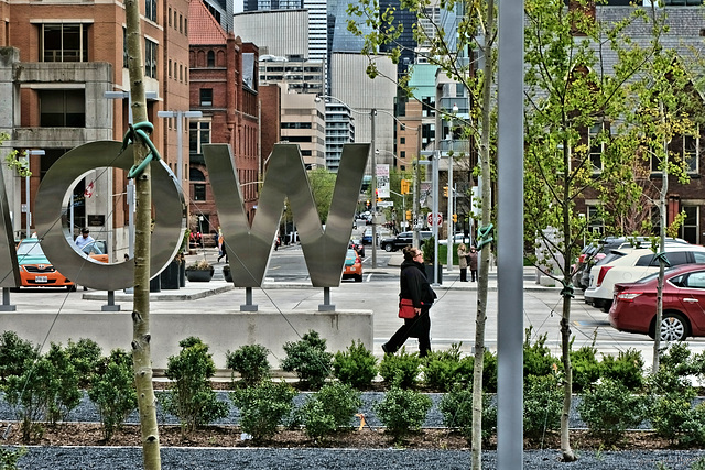
Looking south from the Women's College Hospital parking lot down Dr. Emily Stowe Way and Elizabeth St.

Berny, Smiley Derleth, , Steve Bucknell and 5 other people have particularly liked this photo


10 comments - The latest ones
 rdhinmn
rdhinmn club
The depth of field here makes it seem like an illustration - no eye could see it quite this way. I just posted wall art, so maybe I'm subject to the recency fallacy, but this looks like more if it. The not-quite-strong verticals of the pole and the new tree divide it nicely into a triptych, too.
7 years ago.
John FitzGerald club has replied to rdhinmn club
I hadn't noticed the triptych, Bob, so thanks. The camera doesn't see things the way the eye does, and I think that becomes more obvious in a long shot -- the edges of the photo are as sharp as the centre, while our eyes see things very accurately in the centre and vaguely on the periphery. Usually I'd be stopped all the way down for a shot like this, but I relented a bit because of the light. Still, I used a fairly narrow aperture and got deep DOF. OK -- I sharpened up a couple of the the far buildings a bit
7 years ago.
 Will S.
Will S.
'Ow!' said the hospital patient. ;)

Deliriously busy. I like it.
7 years ago. Edited 7 years ago.
John FitzGerald club has replied to Will S.
I didn't shoot it very level, Will, and when I straightened it most of the M on the left had disappeared. There wouldn't have been enough to say MOW, but the crop made the OW stand out, I think.
7 years ago.
 Gisela Plewe
Gisela Plewe club
Dicht!
7 years ago.
John FitzGerald club has replied to Gisela Plewe club
I think I used as much zoom as I had for this one, Gisela, so it's a bit compressed.
7 years ago.
 Ulrich John
Ulrich John club
Great composition, John. There's a lot to see on this picture. Lines and angles as usual on your pictures. And the woman walking through is the highlight. Good Morning !
7 years ago. Edited 7 years ago.
John FitzGerald club has replied to Ulrich John club
Thanks, Ulrich. The woman was actually striding, but I clicked at the wrong time to catch her right arm extended.
7 years ago.
 Steve Bucknell
Steve Bucknell club
Somehow it looks like a photograph of a photograph, or, as Judith says, a kind of collage of a city. An odd effect!
7 years ago.
 John FitzGerald
John FitzGerald club
As I mentioned to Judith, Steve, that's probably the result of using all the zoom I had and of the absence of shadows.
7 years ago.

Sign-in to write a comment.