Namias' Sepiaprint 2
Carlevaro Beach Salt Print
Vidar's Sunlight
Hovedøya Kloster (cloister) II
Marshall Gulch
Ragle Oaks
Duncan's Landing Salt
Redwoods in Fog
Laguna de Santa Rosa
oak and cart
Oak Salt Print
Burbank Oak Salt Print
Raining
Santa Rosa Creek Salt Print
Huichica Salt Pond
Crane Creek Salt Print
See also...
Keywords
Authorizations, license
-
Visible by: Everyone -
All rights reserved
-
1 131 visits
Namias' Sepiaprint


Rodolfo Namias' Sepiaprint
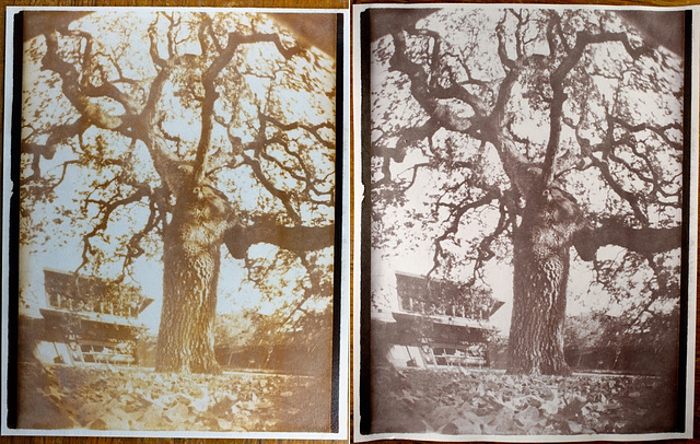
Pinhole paper negative, heritage oak at Finley Community Center in Santa Rosa, California
Left: still wet after fixing. According to Namias, the browns would get much darker if allowed to dry.
Right: final dry print after toning.
I read Namias' 1901 article describing an iron-silver process. It is somewhat like a so-called “Van Dyke Brown” print, but uses citric acid instead of tartaric acid. It is not one of the historic processes that has remained popular today. I can't find much record of its use, except in “sepia paper” used for copying technical drawings, similar to the way blueprints were used. Since I had all the needed supplies, I thought I'd try it.
I followed the directions in the article and made this print from a pinhole paper negative. Everything went just as Namias described, which in itself is a refreshing change from usual. Usually there are all sorts of things that can go wrong, but it made a nice print on the first try.
This must be the simplest and easiest printing process I've ever tried:
* brush on the senistizer, let dry
* expose the print
* wash for 2- 3 minutes
* fix for 2-3 minutes
optional: tone after fixing
* wash.
Everything was done as simply as possible. I already had eyedropper bottles of
24% silver nitrate
12% citiric acid
that I use to make salt prints. I made another eyedropper bottle with:
25% ammonium ferric citrate
A drop ratio of 1:2:2 is close to the formula in Namias' article. I used:
6 drops silver nitrate + 12 drops citric acid + 12 drops ammonium ferric citrate
This was much more than enough to coat a piece of 5x7 inch paper.
I used Canson Universal Sketch paper, which does have an alkaline buffer, but it worked just fine.
You can see the highlights are perfectly clear white with no fogging and no hint of yellow.
Brushed on with an inexpensive foam brush, no brush marks or uneven areas are visible.
Exposed it for ½ hour under BLB compact fluorescent lamps, it did not look done, so exposed for ½ hour more. Then it was time for dinner so I just turned the lamps off.
After dinner, it was interesting to see the image intensify in the wash, just as Namias described. Then it intensified again and changed color in the hypo. I used a rounded ½ teaspoon of sodium thiosulfate in about 60ml water to fix the image.
Namias recommended gold thiocyanate toner after fixing, so I mixed a weak toning solution of:
2.5 ml 0.2% gold chloride + 2.5ml 2% ammonium thiocyante in about 70ml distilled water.
Toned in this for about 10 minutes, until it did not seem to be changing much.
Washed for an hour then dried on a sheet of glass overnight.
I think it is remarkable how there is detail in the deepest shadows ( on the tree and in the background on the right ) and in the most extreme highlights ( bulletin boards on the building in the background ). Also the sky is perfectly paper white.
This is a fun and interesting process, and particularly simple. Next time I will let one dry down without toning and see what it looks like. With the right negative, it might make a nice print!
Formica, Graham Hughes, and 2 other people have particularly liked this photo
- Keyboard shortcuts:
Jump to top
RSS feed- Latest comments - Subscribe to the comment feeds of this photo
- ipernity © 2007-2025
- Help & Contact
|
Club news
|
About ipernity
|
History |
ipernity Club & Prices |
Guide of good conduct
Donate | Group guidelines | Privacy policy | Terms of use | Statutes | In memoria -
Facebook
Twitter

Ned club has replied to Graham HughesSign-in to write a comment.